MIRACLE DRINKS
Repositioning an Ayurvedic health drink from medicinal to lifestyle, without touching the bottle.
00

Challenge
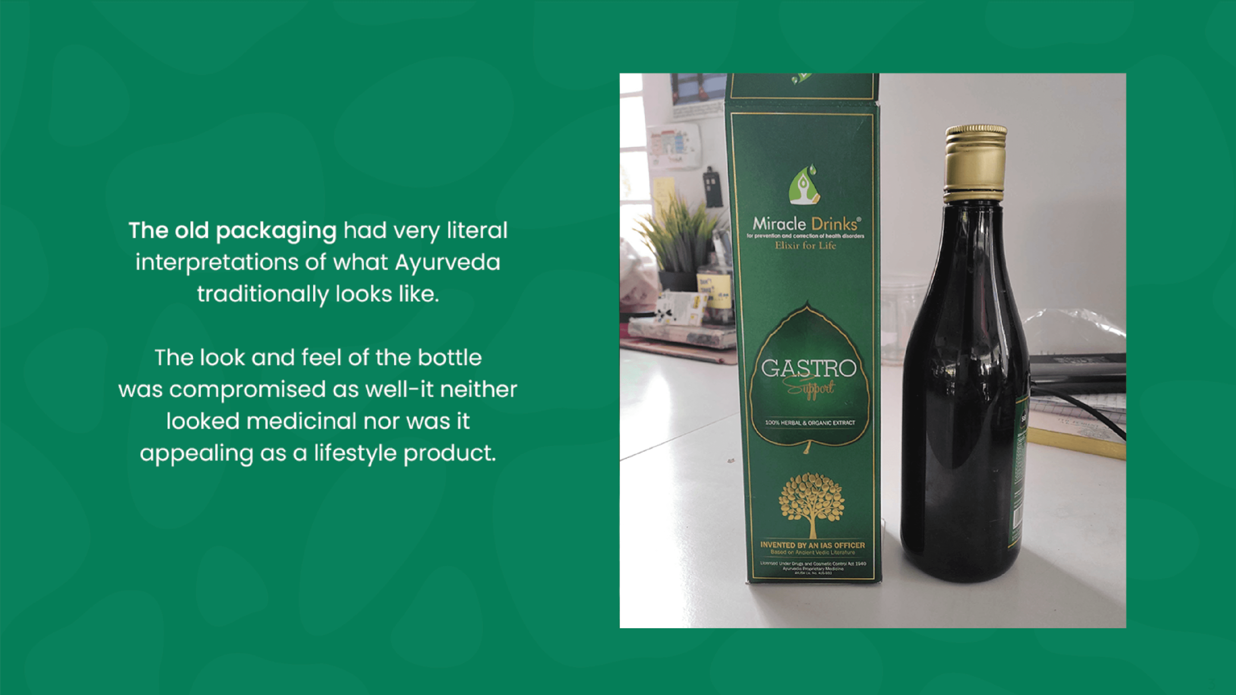
Miracle Drinks makes plant-based health drinks backed by Ayurvedic science. The products worked. The packaging and idea of ayurveda made them look like medicine. The brief was to reposition them as a lifestyle offering without touching the bottle structure or its colour. Everything had to happen on the label and the outer box.
Approach
The insight from research was simple: the product needed to feel chosen, not prescribed. We framed the brand around "NeoAyurveda", Ayurvedic science made contemporary, prevention over cure. Each label was designed to lead with its targeted benefit and a distinct colour, making the 8-SKU range individually clear and visually cohesive at once. We also flagged that the clear bottle was reading as alcoholic and recommended matching cap colours to labels a small fix with significant shelf impact. Marketing collateral used photo manipulation to embed the product into real lifestyle contexts: aging well, city life, adventure so it felt lived-in rather than prescribed.
My contribution
I was part of the research and positioning process, contributing to the NeoAyurveda framing and packaging concept. All design execution, packaging design and marketing collateral, was done solely by me.
year
2023
timeframe
8 weeks
tools
Illustartor, Photoshop
category
Brand Strategy . Branding . Packaging
01

02

03

04

05

06

07

08

09

010


